Proven Tactics: Website Features to Guide Your Booking Funnel
Mike Doute
6/20/2022
There is no shortage of articles that go over how to improve a purchase funnel, or different tactics to help reduce cart abandonment on general ecommerce websites—but there are few about how to do this specifically for vacation rental websites. There’s a big difference between the process of buying a new T-shirt versus booking a vacation. As such, there are some key differences in the purchase funnel, or booking funnel as we’ll call it, which we’ll go over in this article.
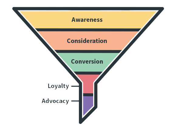
When marketers talk about shopping funnels, this is typically what it looks like:

In the vacation rental industry, however, things aren’t always so straightforward. Consider all of the different questions someone who has decided to take a vacation might have:
- Where do I want to go?
- What is my budget?
- What kind of rental am I looking for?
- What kind of amenities do I care about?
The list goes on from there, and because of all of these questions and all of the different options out there, this is what a booking funnel tends to look like this:

So, how can you make it easier for potential guests to book their vacation, and what kinds of website tactics can vacation rental managers utilize to remove friction from their booking funnel and keep it buttery smooth?
1. Have a Fast Website
This one is obvious and has been preached for years. According to a Google study, over half of the people who try to visit your website will leave immediately if it doesn’t load within three seconds. One of the biggest killers of load speed is large image files. You need to strike a balance between high-quality, high-resolution images and optimized image files. Here are some ways to do this:
- Properly size your images—normally you shouldn’t need to load anything over 2,000 pixels wide into your PMS.
- Compress images before uploading—use a tool like app to bulk compress (which is different than resizing) before uploading.
- Utilize next-generation image formats.
Utilize tools such as Google Page Speed Insights and GTMetrix.com to find other opportunities to speed up your website and send what you find to your developers.
2. Build for Mobile First
Everyone from digital marketers to web developers are guilty of this; we all tend to look at websites on our desktop as we work on them. However, only about 30-40 percent of your website traffic will be coming from desktop users. Typically, mobile traffic makes up 60-70 percent. However, most bookings still take place on a desktop device.
Regardless of why people decide not to book on their phone, you should focus on making sure that your mobile website isn’t actively preventing bookings. To do this, visit your website on your phone and ask yourself these questions:
- Is the website slow?
- Is it easy to search?
- Is the booking process a pain?
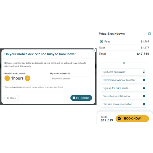
Pretending to be a user on your own website is a great way to see where users may experience friction in the search and booking process. You should also be proactive about turning mobile visitors who aren’t ready to book into leads by giving users the option to come back and book later. One example of this is ICND’s “Remind me to book later feature.” This feature automatically emails the person at a time of their choosing and prompts them to book, while also turning this person into a lead.

3. Give People What They Want
We need to make sure that we’re directing users to the booking-side of our website, because that’s what they’re (usually) on your website to find. Follow this rule of thumb: It should never take more than one tap or click to get to a property or search page. No matter where someone is on the website, they need to be able to get to a booking engine page to see properties in just one click.
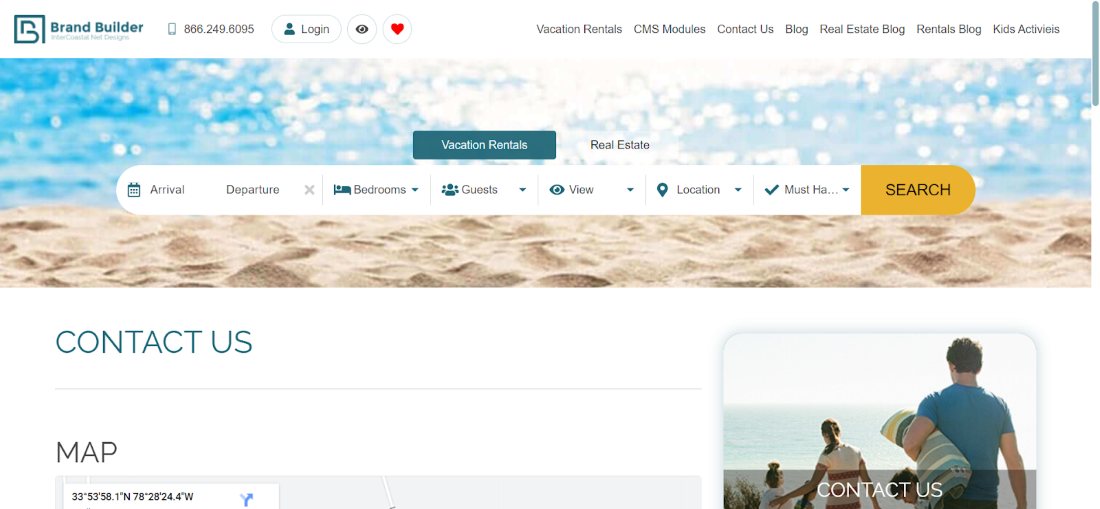
A great way to do this is to include a hero section on each page with a search bar that leads directly to the booking engine.

Another way to do this is to include your main search page as a prominent link in a sidebar, or in your navigation menu (although we recommend a more prominent CTA like the hero search).
4. Make It Easy to Search
As a vacation rental manager, you know your inventory and guests’ desires better than anyone else. Make sure that commonly requested amenities and locations are easy to find in your search filters. Also, make sure that amenities aren’t so similar to one another that they’re confusing to potential guests (especially those not familiar with your area). For example, some OTA websites will list beach, beachfront, ocean, and oceanfront as search filters, all right beside one another as options, without explaining the differences.
If your PMS requires you to separate different amenities, such as waterfront versus beachfront, ask your website booking engine provider if they have any amenity grouping features. ICND’s AXIS Amenity Mapping function is able to group similar amenities into one selection for the website to make searching easier for your guests.
5. Say “NO” to Sticker Shock
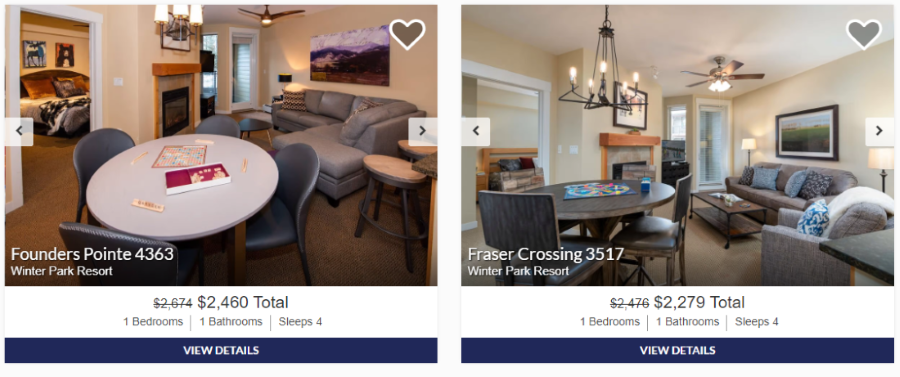
Nearly half of all online transactions are abandoned because of higher than expected extra costs at checkout, according to a 2021 study by Baymard Institute. To combat this, make sure that you’re showing the grand total price (base rent plus taxes and fees) as early as possible in the booking funnel. Ideally, users should see a total price including taxes and fees after running a dated search. This will avoid any sticker shock later on in the booking funnel and reduce your cart abandonment rate. The Sarah and T podcast episode “VR Website Pet Peeves Revisited,” digs into this mentality.

You should also make sure that you’re itemizing taxes, fees, and any discounts so that users understand exactly where the grand total is coming from. You can do this by having a line item for taxes, fees, and savings on property and checkout pages.
Here are some rules of thumb to follow to make sure that pricing isn’t holding you back:
- Always use grand total pricing when possible.
- Don’t wait until the final checkout page to show the total price, show it on the property page.
- Itemize taxes, fees, and savings.
6. Make ‘Em Sweat!
Instilling a sense of urgency in shoppers is a great way to help nudge them down the booking funnel because it makes them realize that the property or deal that they want won’t be around forever. By giving people a little bit of FOMO, we can encourage those who were on the fence to go ahead and book ASAP.
These urgency features can be used directly on property pages:

On search result pages:

And even in your footer:

Just make sure that your urgency messaging isn’t getting in anyone’s way while they’re trying to search and book!
7. Have a Clean, Updated Property Page
Your property detail page (PDP) needs to really sell the property, and there are some features that it needs to have:
- Quick load speeds
- High-quality photos
- Current reviews
- Property address/map
- Clear, competitive pricing
- Calls to action (CTAs)
Remember, calls to action aren’t just “book now”; you should consider having other CTAs that can turn users who aren’t ready to book into leads. You can do this with property Q/A forms, a “remind me to book later” feature, a price change notification feature, or anything else that would require someone to add their contact information.
Also, make sure that your property descriptions don’t prominently feature outdated info such as “renovated in 2014,” or “DVD player included.” Try to lead with the most compelling features of each rental, and make sure to update them yearly.
Pro Tip: Go to Google and type in “site:[yourwebsite.com] “updated in 2018” -inurl:blog”
This will show you all of the pages on your website (minus the blog) that contain the text “updated in 2018.” Change this to look for other text or content.
8. Capture and Re-Engage with Leads
Just because you want your website to be a direct booking machine doesn’t mean that you should forego other conversion actions. Remember, not all users are ready to book now, so give them other options of contact, like signing up for price change notifications, or other CTAs that could turn them into a lead.
The next step—and most overlooked step—is to actually get a plan in place to reach out to those leads to turn them into guests. This doesn’t necessarily mean you need to manually email or call them; you can automate a lot of this. One way to automate your booking funnel is to set up a booking abandonment email, which is sent to users who have viewed a property and entered their email address; it will prompt them to come back and book.
9. Leverage Trust Factors
Trust factors such as reviews are incredibly important. Ninety-three percent of online shoppers will look at reviews before making a purchase. Make sure your website prominently showcases the following kinds of reviews:
- Reviews of your company
- Property reviews
- Property star ratings
Beyond reviews, it’s also important to showcase your personality and brand. You’re not an OTA, so don’t act like one! A great way to build trust with shoppers (and Google) is to have an “About Us” page that showcases your team, company history, owners, mission statement, and achievements.
Now that you have nine website tactics to improve your booking funnel, it’s time to get optimizing!
Mike Doute
Mike Doute is an experienced SEO and SEM professional at ICND, who enjoys finding data-driven solutions to help his clients reach their goals.